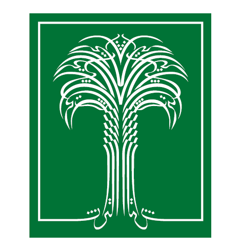
The Story of Al Turath Logo
His Royal Highness Prince Sultan bin Salman bin Abdulaziz, founder and president of AI-Turath Philanthropy Foundation, conceived with Dr. Ahmed Mostafa the design of the logo for AI-Turath Philanthropy Foundation, which embodies it’s identity, and represents an authentic it in a symbol consisting of the following:
– A white frame that takes on a rectangular shape and embraces the date palm, which represents heritage, indicating human awareness of its heritage value.
– Another white frame that matches blends in the words “AI-Turath in the roots”.
– The two words “AI-Turath” reflect one another and form the roots of the palm tree.
– A tall palm tree whose branches are formed from the repeated word AI Turath repeated six times.
– The letters thaa from the word AI-Turath sit like a crown on top of the palm tree.
– A green background expresses AI-Turath space represented by the date palm tree.
Reflecting on the palm tree in the logo, Dr. Ahmed Mustafa says “that good AI–Turath is like a good tree with stable roots and rising to the skies.
As you can see, the word “AI-Turath” is woven into every detail of this palm tree, and all that is linked to it, whether in its soil or its environment as represented by the space set in bounded by the frame, which in turn reflects human awareness of what he incorporates, in this case it represents the human awareness of the heritage.
Dr. Ahmed Mostafa then added:
“I found it wise to confirm and consolidate this concept of nature, by showing the vertical balance in a way that avoids monotony, I have found – through experience – that placing the letter Thaa in the direction of the axes on which the fronds are attached, creates a visual vitality that is a source of dialogue and appeal with the form, and to to control this vitality a series of these thaa letters were deliberately designed in a manner to indicate growth and sublimity creating a crown quasi invisible at the top of this palm tree, or as if structural skeleton upon which the top of this palm tree is built”.